Connect Doc is a jewel of app design from Crownsoft. This healthcare case study explores the project’s intricate details, including its purpose, challenges, and solutions provided.
Increase in Downloads
Improvement in User Engagement
Increase in Customer Retention
Increase in Average Revenue Per Patient
The fusion of high quality healthcare with high performance mobile app UI & UX.
Smartphones and mobile devices have already revolutionized multiple industries, including restaurants and dining, ride-hailing, and grocery shopping. With a mobile app, businesses can increase engagement, revenue, and brand visibility.
Our client, a Texas-based private healthcare practice, was looking to improve patient access to consultations, appointment scheduling, and health record management based on their patient surveys. Our client’s existing app, built by a freelance developer, suffered from poor design, unresponsive screens, abrupt app crashes, and unresponsive functionality. Since healthcare apps are a life and death scenario, the client demanded robust functionality with a high performance UI & UX.
Healthcare
United States
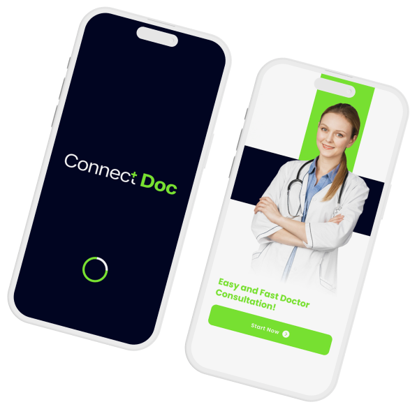
The Crownsoft app design team was contracted to completely redesign the Connect Doc app from its preceding UI and UX. The biggest challenge was integrating all of our client’s services within the app’s limited screens. Crownsoft designers were
required to prioritize the most important information and functionality and discover ways to present it in a visually appealing interface.
Our team had to resolve a crucial challenge from the previous app design: accommodating its screens to be responsive for varying screen sizes, resolutions, and capabilities across different operating systems.
Lastly, our mobile design UX team was presented with the problem of context in which patients interact with the app. Since Connect Doc is a healthcare app, it is often used on the go, in diverse situations, and with different goals for every user. This could entail using the app in an emergency, using the app with a disability, or simply using it for information purposes, etc.
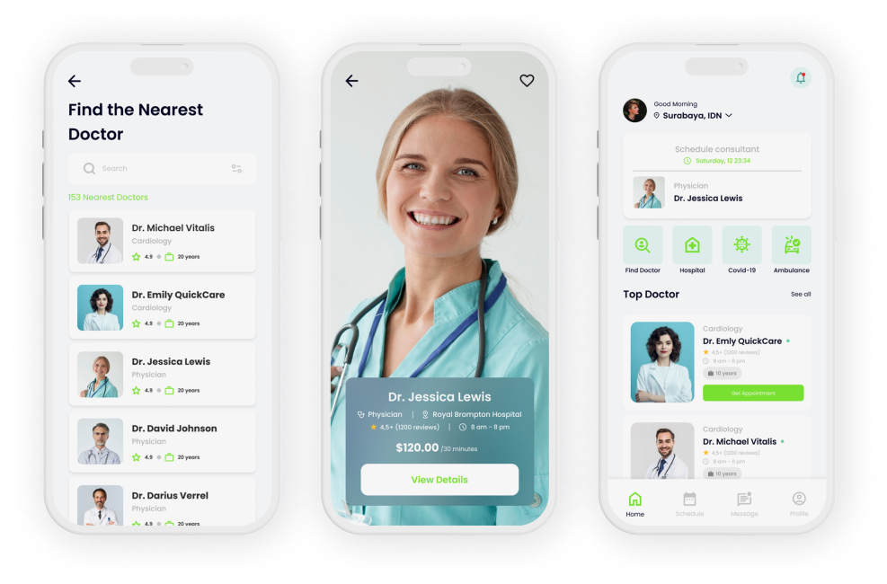
Crownsoft’s designers went back to the drawing board to reinvent a cross-platform mobile app design (iOS and Android) that would resonate with all of Connect Doc’s audiences. Our primary goal was to offer an easy-to-use, and fully functional app interface for patients aged 30 and above.
Connect Doc was embedded with a high-quality interface to display doctor profiles, integrate phone calendars, and clearly display digital health records and reports, especially for senior patients. The Crownsoft design team thoroughly tested the design across Android and iOS devices including Apple, Samsung, Motorola, and Google Pixel smartphones.

Crownsoft is deeply honored to have been contracted for the creative redesign of
Connect Doc to give it an entirely fresh user experience.
Our design team conducted extensive user flow research for Connect Doc, focusing on a seamless, secure, and user-friendly experience. Essential features include doctor profiles, online appointment scheduling, calendar sync, video consultations, and secure payments. Ensuring HIPAA compliance, the app also offers cloud-based record management with robust encryption and optional two-factor authentication.
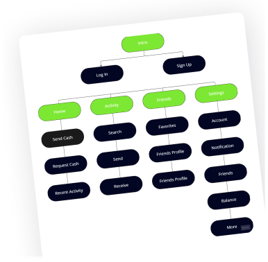
The revised design system for Connect Doc focused on clarity, accessibility, and consistency across iOS & Android platforms. Incorporating patient feedback, the new design features intuitive icons, cohesive brand color schemes, and responsive layouts. This overhaul improved user interaction, ensuring an engaging and visually appealing healthcare management experience for patients.
The revised design system for Connect Doc focused on clarity, accessibility, and consistency across iOS & Android platforms. Incorporating patient feedback, the new design features intuitive icons, cohesive brand color schemes, and responsive layouts. This overhaul improved user interaction, ensuring an engaging and visually appealing healthcare management experience for patients.
The low-fidelity prototype was developed in the third week of the project. Our design team and Connect Doc team consistently collaborated to capture ideas and wireframe the chosen concept. Our team conducted a pilot test with the basic design, identifying the drawbacks & gaps of the low-fidelity concept and finally selected the one that the focus group patients rated higher. The purpose of a low-fidelity concept was to collect crucial user feedback, reduce development risks, and integrate ideas from the Connect Doc team into product design & development.
The low-fidelity prototype was developed in the third week of the project. Our design team and Connect Doc team consistently collaborated to capture ideas and wireframe the chosen concept. Our team conducted a pilot test with the basic design, identifying the drawbacks & gaps of the low-fidelity concept and finally selected the one that the focus group patients rated higher. The purpose of a low-fidelity concept was to collect crucial user feedback, reduce development risks, and integrate ideas from the Connect Doc team into product design & development.
The high-fidelity design was created to demonstrate the final version of the app in the last week of the project. Through exhaustive research and planning Crownsoft’s design team ascertained the goals of the finalized design. After defining key interactions and functionality, the design team added visual assets, animations and transitions from our vast design library. Our team’s visual design details and real content display the look and feel of the end product. The high fidelity design was successfully handed off for development with an improved user experience, completing Crownsoft’s engagement for the project.
The high-fidelity design was created to demonstrate the final version of the app in the last week of the project. Through exhaustive research and planning Crownsoft’s design team ascertained the goals of the finalized design. After defining key interactions and functionality, the design team added visual assets, animations and transitions from our vast design library. Our team’s visual design details and real content display the look and feel of the end product. The high fidelity design was successfully handed off for development with an improved user experience, completing Crownsoft’s engagement for the project.
Connect Doc is built with a high fidelity design and fully responsive interface with simplified screens designed for
improved onboarding, usability, and accessibility.
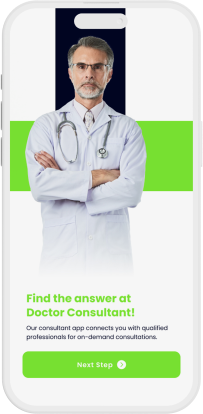

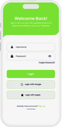
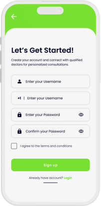
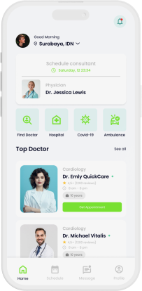
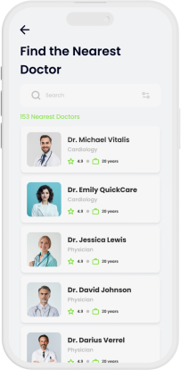
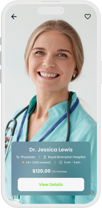
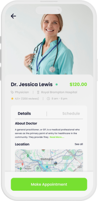
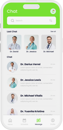
Connect Doc successfully refines the idea of smart healthcare into a secure and patient-friendly mobile application. The new app design overcomes crucial challenges with intelligent problem-solving, thus offering patients a premium healthcare app UI and UX. Crownsoft’s design team invested considerable time in researching the intuitive and user-friendly design, ensuring accessibility, responsiveness, and a rich user experience.


Connect Doc
Schedule a free consultation with our tech advisor & app delivery manager Jason Smith. Our head of product delivery will listen to your unique digital ideas, offer expert advice, and provide you with precise cost estimates for mobile app development services. So why wait? Grab a spot on Jason’s calendar and get a free consultation to begin your dream app project underway.
Enter your details to schedule a FREE discovery call and receive project estimate by our App Experts
1567, 701 Tillery Street Unit 12, Austin, TX, Travis, US, 78702
Crownsoft © 2025 | All Rights Reserved
Crownsoft © 2025 | All Rights Reserved