Team Crownsoft is honored to have delivered the captivating cross-platform app for the Netty Bell e-commerce store.
Increase in Downloads
Improvement in User Engagement
Increase in Customer Retention
Increase in Average Revenue Per Patient

Netty Bell is a clothing and apparel brand founded in the USA by entrepreneur Annette Bell. After the brand’s ecommerce website success, Annette Bell sought to spread the creativity of her unique bell-inspired T-shirts and apparel to a diverse audience.
Netty Bell is a clothing and apparel brand founded in the USA by entrepreneur Annette Bell. After the brand’s ecommerce website success, Annette Bell sought to spread the creativity of her unique bell-inspired T-shirts and apparel to a diverse audience.
Built on the brand philosophy of “Coming together to get our Ding Dong on!” unity and celebration lie at the brand’s heart. Founder Annette Bell approached Crownsoft to develop a brand new mobile application, aiming to expand access to a larger audience across the US.
Healthcare
United States
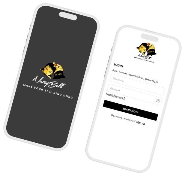
Netty Bell’s growing success demanded that the founder expand the company’s scale and develop new digital touchpoints for customers. The real challenge, however, was to create a marvelous, feature-rich mobile app that could compete against the numerous options already existing in the United States.
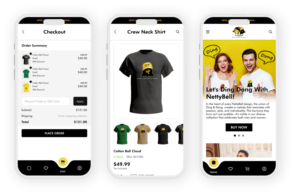
Facilitated by extensive market research and customer surveys, Crownsoft’s team had a precise understanding of the brand’s target audiences and need for new revenue pipelines. Our team focused on developing a reliable & aesthetically pleasing Ecommerce app that integrated the existing ecommerce website interface into the app. The appealing interface included the same customer centric navigation like Shopify, secure payment integration with Stripe & Paypal, personalized buyer recommendations, and a brand inspired design system.

Crownsoft is deeply honored to have been contracted for the creative redesign of
Connect Doc to give it an entirely fresh user experience.
The NettyBell website and competitor applications gave our designers ample insight into crucial user goals, including product discovery, cart management, and checkout. From there, mapping the user journey for different actions, such as new users and returning customers, became easier.
The Crownsoft design team developed low-fidelity wireframes to visualize NettyBell’s app structure with Miro. We documented the user flow and enhanced the overall experience based on the website buyer journey, developing a strategic roadmap for future improvements.
Netty Bell’s new app design system was inspired from the website. Elements including font classes, color palettes, and other visual guidelines were adopted from existing brand assets for consistency. A reusable component library was created with Figma. Buttons, input fields, animations, navigation, and several other UI elements were added to the reusable library to ensure faster development, consistency, and flexibility. Cross device responsiveness was crucial, therefore, a responsive grid system was deployed. Comprehensive design system documentation was also created for future reference.
Netty Bell’s new app design system was inspired from the website. Elements including font classes, color palettes, and other visual guidelines were adopted from existing brand assets for consistency. A reusable component library was created with Figma. Buttons, input fields, animations, navigation, and several other UI elements were added to the reusable library to ensure faster development, consistency, and flexibility. Cross device responsiveness was crucial, therefore, a responsive grid system was deployed. Comprehensive design system documentation was also created for future reference.
The low-fidelity design was created with basic wireframe sketches on Miro. Our focus was on building the same layout and functionality as the website for smaller screens. The LF design was presented to the client and was successfully approved, with several changes to the user flow and positioning of elements for better usability.
The low-fidelity design was created with basic wireframe sketches on Miro. Our focus was on building the same layout and functionality as the website for smaller screens. The LF design was presented to the client and was successfully approved, with several changes to the user flow and positioning of elements for better usability.
After the client approved the low-fidelity design, a detailed pixel-perfect mockup was crafted with Figma. UI elements were finalized after a detailed feedback session, which approved the color palette, font family, and interactions. Actual content, images, and animations were integrated, ensuring alignment with the brand identity. The design team then crafted a prototype for sampling and delivered it to the client, allowing design finalization and developer handoff.
After the client approved the low-fidelity design, a detailed pixel-perfect mockup was crafted with Figma. UI elements were finalized after a detailed feedback session, which approved the color palette, font family, and interactions. Actual content, images, and animations were integrated, ensuring alignment with the brand identity. The design team then crafted a prototype for sampling and delivered it to the client, allowing design finalization and developer handoff.
NettyBell was designed and developed with a fully responsive hybrid UI featuring brand-inspired fonts, colors, and user experience.
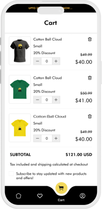
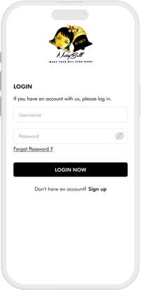
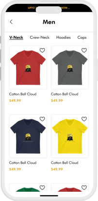
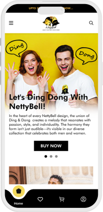
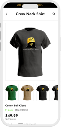
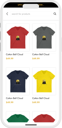
The Netty Bell app showcases Crownsoft’s renowned design, development, and project management expertise. From being visually captivating to functionally flawless, the app offers an immersive shopping experience encapsulating the brand experience on mobile screens.
The NettyBell app illustrates our team’s commitment to excellence and delivering better value to drive Netty Bell’s success.


Founder, Netty Bell
Schedule a free consultation with our tech advisor & app delivery manager Jason Smith. Our head of product delivery will listen to your unique digital ideas, offer expert advice, and provide you with precise cost estimates for mobile app development services. So why wait? Grab a spot on Jason’s calendar and get a free consultation to begin your dream app project underway.
Enter your details to schedule a FREE discovery call and receive project estimate by our App Experts
1567, 701 Tillery Street Unit 12, Austin, TX, Travis, US, 78702
Crownsoft © 2025 | All Rights Reserved
Crownsoft © 2025 | All Rights Reserved